Component 3: Final Piece

This blog post, written by me (Nayana), contains the final piece of our music promotion package project.

Music Video


Use this link in case the video is removed from YouTube: *LINK*

Digipak

Front Cover


Inside-Left


Inside-Right


Back Cover

Mock-up (credits to: Timo)

Social Media

Here is a link to our live social media account: https://www.instagram.com/kiaraa_music/

Instagram social media layout

bio/description part of our page

linktree provided in our bio

caption example 1

caption example 2


interaction in our page

interaction in our page


Component 3: Post Production

This blogpost was made by me (Nayana) but taken from our editor, Timo’s blogpost

To begin, I opted for Adobe Premiere Pro CC 2020, a timeline-based and non-linear video editing software application, as my primary tool for video editing due to its comprehensive features and interface I was already familiar with as I have used it for over 3 years. After each day of filming, I established a habit of managing my files by transferring the necessary clips and images from the SD card to my desktop, ensuring a streamlined editing workflow. Once imported into Premiere Pro, I filtered the shots, eliminating any footage deemed irrelevant. The software's intuitive design facilitated the synchronization of clips, with the marking feature being very useful. This feature allowed me to label specific points in the timeline, enhancing precision and efficiency in the editing process. 

Shown below is the overall timeline of the project:

As seen in the image above, the use of markers proved to be very useful. Since I am editing a music video for the first time, the process of doing so requires a new step that was previously foreign to me. Before importing any clip into the timeline for an edit, I needed to sync the scene to the music. This is because a slight delay would be very obvious, especially in scenes where there is a close-up of an actor lipsyncing to the camera, a slight delay of a few seconds would make the product look ugly and unprofessional, which is why I had to be very detailed when syncing clip audios to the song. However, during our filming process, we had a clapboard which made it easier to sync clips, because the audio in the timeline would have a spike because of the loud sounds, giving me a guide on where to cut the clip. An example of this is shown in the image below:


SIGNIFICANT EDITING CHOICES AND METHODS

Colour Grading (Lumetri Color)

before colour grade

after colour grade


color wheels in premiere pro


Knowing that we have a theme and color scheme to follow, I saw that the raw clips were far from the right color to portray what we wanted, with this, I spent hours colour grading the clips to find the perfect balance between warmth, saturation, and exposure we wanted. I believe that the colour grade I created portrays the perfect amount of warmth that is felt when friends get together, just like the scene depicts.

Speed Ramping (Time Remapping)

example of a clip that uses speed ramping (2:43-2:47)

speed ramping keyframes

Speed ramping is a technique of smoothly transitioning between different playback speeds within a single clip or sequence. This allows for dynamic changes in speed, creating visual interest and emphasizing specific moments in a video. This method of editing was done in three steps; in the timeline, position the playhead where you want the speed change to begin. Set a keyframe for the Speed/Duration option in the Effects Control Panel. Move the playhead to where you want the speed change to end and set another keyframe. Then, change the speed value between the keyframes to the desired speed.  You can then adjust the bezier handles on the keyframes to control the easing in and out for a more gradual speed change. Overall, the use of speed ramping was very useful in creating emphasis, and adding drama to a simple action. In the clip above, the girls are seen to be opening a picnic blanket, with speed ramping, a simple action can become very visually pleasing.

Jump Cuts

scene that uses jumpcuts (1:12-1:18)

jumpcuts in timeline


In this music video, jump cuts are utilized to adjust their actions to the pacing of the music. By identifying static points in the footage where minimal changes in framing or camera position occur. I used the razor tool to cut the clips at these jump-cut points and arrange the remaining sections consecutively on the timeline.

Reflection: The features of our editing software helped us so much in enhancing our editing and product itself especially when we finished our shoot quite near to our deadline. This also allow him to experiment and explore to see which editing suits the best with our concept and liking. The color grading feature was also really useful as most of our scenes were shot in a weather that wasn't too vibrant and lively.

Component 3: Critical Self Reflection

 This blog post contains the critical self-reflection I made.

Critical Self Reflection

Cambridge gave many briefs I could choose from, amongst all the given options, I chose music promotion package. As media continues to cultivate, the art of visual representation of songs starts to succumb, thus this music video will be my take of appreciation to relieve its era. To achieve this, we chose the recent song Feather, originally by Sabrina Carpenter, performed by KIARA. For this, I decided to work in a group of 4. I will specifically be talking about our pre-production, production and post-production.

While planning our music promotion package, we focus on research and development. We decided to have teenage girls for our social group and target audience, shown by the actresses we chose. This would make the corresponding population find it easier to empathize though still be easily accepted by everyone. We want to highlight the social issue of love, break-ups and the process of self realization and moving onto new steps of life, instead of dwelling the past which currently is a famous concept.. We decided to use the song “Feather” originally by Sabrina Carpenter as we felt it had the mood we are looking for - upbeat, light and free. This show our representation of break-ups is in a positive light as our preferred reading is audience feeling positive, sees a break-up as nothing and to recognize the life out there even when there is no romantic love. Our artist, Kiara, has a reel persona of an achieved individual with a socialite lifestyle, with many friends, well liked but at the same time humble and down-to-earth. We also researched on music videos with similar genre or plot to see what are the conventions of pop songs with our plot. We conform with those ideas so our product easily falls to the genre. Alike other music videos we researched that sets in summer, we chose bright and refreshing colors to revolve around which highlights the lively mood we want our audience to feel. This also affected the social media and digipak design that we made as the colors used should also be eye catching for audience. We chose typical locations of a summer music video, which includes the beach and park to develop our music video to be the genre we want. My personal use of social media, also played a part on how we produced the page for our artist, as I prefer more participation when connecting with audience, I decided to apply the same method for our artist so fans would feel more appreciated and recognized - this is seen through our 10 questions interview video and the dance video challenge that we planned to make.

While producing our music promotion package, we focus on the media language we use. We had plenty of media language to represent the stereotypes we showcased - which is seen through their outfit and their actions. For our ex-lover character, we want to characterize him as a player which we show through his outfit including a leather jacket and slicked back hair. Another stereotype we mentioned was girlhood culture, which had elements of what is typically seen as for girls - including the use of props like beauty products, accessories, flowers and their actions which was flamboyant and feminine shown by how they walked or bonded. In order to achieve the brand we have decided for Kiara, we set her scenes to be the spotlight and central of her friend group and with scenes like her as the one taking the selfie for the group, we try to show that she is someone prominent of the group and her consistent outfit of a long white dress to highlight her difference and pink pajamas to give her femininity. We also paid attention to the camera angles that we used in our video such as close-ups, included to make audience feel more connected and personal to the artist as they can see clearly their expression and visual, which for fandoms, could be an important factor as existing technology enable audiences to make edits or videos of their artists which is a big trend today. Other camerawork used includes medium close-up angle shots which was used to showcase her actions while performing or when bonding with her friends - this gave more meaning to the video as we directed her movement to convey freedom and fun. All of our products of our package shares similar photos that were taken amidst our shoots, having photos from each setting to be part of either our digipak and social media as well, this is done to tie all our products together, making it more coordinated and matched.

While editing and designing our package, we focus on its interactive content. While editing our social media page, we made sure to have an element that can link to visit our music video and other medium such as a website or online album which we made with a LinkTree. We also made it available for audience to interact through our comment section in each posts and a question box which they can fill. This can be effective to develop a fandom (Henry Jenkins), specifically to be a prosumer where consumers are able to produce content that relates with the artist. We also designed our page to also include her real persona, featuring pictures of her outside of the direct promotion of her song to be more appealing (Stardom theory, Richard Dyer), highlighting her ordinariness, showing her normal life. The developing technology of smartphones and he internet allows audience to respond and interpret the product differently which may form discussions and be an application of Blumler and Katz’ Uses and Gratification theory of social relationship and even personal identity where they see her as a role model. This technological convergence is important for artists as it broadens their audience as they reach more people from different area and social media. We made sure to have similarity across mediums in terms of the color palettes, typeface and editing style used as well.

Component 3: Digipak Research and Development

This blog post, written by me (Nayana) contains my personal research and development into making the digipak.

Research


Above I have attached some digipak layouts and designs I was interested in and figured would match our theme. I aim for a timeless design for it to always look nice and presentable even in years ahead. In terms of layout, I also looked at albums and vinyl covers from K-pop artists and some pop artists, I did this as today, actual digipack is not as common hence I looked at the closest creations.

Making this research I realized I do not really like having a direct photograph of our star as our CD as seen in figure 2 because the hole made a cut out which I found pretty awkward so I much prefer having a more subtle photograph if we end up using one, as seen in figure 11. I also really liked the idea of a no-face design because we will be adding many pictures of our star in other features of our digipack so having it in a CD might be a bit overwhelming, hence I have other references. Out of all I really liked the CD design seen in figure 6 or figure 7 as it has some elements that give some focus and it doesn't look as overwhelming and was easy to see. I found the design seen in figure 8 was really interesting as everything was connected hence made the whole layout very cohesive, but doing it with writing might not be the best especially when we want to input some other content in the pages, so it might end up looking very messy. But another option to make everything cohesive is by connecting images, as seen below.


I feel the grid layout of pictures looks really neat and clean, it can also be an amazing way of storytelling. But unfortunately, I do not think our concept matches this idea as much.

This research also gave me a further idea of what I want to include in our digipak. As seen in figure 2 and 3, the design gave many pictures which work especially well when the audience is a major fan - hence making it seen as collectible. But an interesting part I never really considered is having a pre-signed section which is a really popular and on-demand element for fans to have a signature of their idol or any celebrity, as it show a personal side towards the idol.

Digipak Cover

Digipak cover is what I consider the most important part as it is the first thing the audience will see, so below I have attached covers I found eye-catching and the conventions of a cover itself.


The type of album cover I really liked focuses primarily on the artist so with a medium close-up or a close-up shot. Full-body shots are also definitely possible but nothing else should be in the frame that makes the audience lose focus. 

Below I attached my inspiration photos that I gathered from various photoshoots that I feel would match our concept. I highlighted how I want the pictures to look ethereal and elegantly depict her but should still be simple and nothing too over the top.


As we use the song Feathers, I also would like to experiment with props like feather itself to see how we can work with it. I have delivered my intentions for our digipak so now I will work together with my team to succeed.

Development

Below I have list the content I plan to have in our digipak. I plan for it to be a 4-page layout hence it will contain these:

1. cover
2. tracklist
3. CD
4. small anecdote
5. hand signature
6. social media information
7. QR
8. barcode

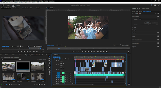
For a visual representation, here is the first draft of the layout that I made


Anecdote

I asked my teammate, Maxi, to write a short anecdote to introduce Kiara. Below is what he wrote.

"After rising into the limelight of public attention at the age of just 13, 17-year-old Indonesian singer-songwriter KIARA continues to push the boundaries of what the music industry considers feasible. Feather - her newest single - debuted at number 1 on the Billboard Hot 100 in 32 different countries. Hailed by both the public and the industry alike as one of the most creative and inspirational talents of her generation, the end of KIARA's rise to stardom is seemingly nowhere in sight."

Tracklist

For the tracklist, I have combined the actual songs from Sabrina Carpenter (original artist) and titles I made up which I think sound nice. It will have 7 songs.

1. Feather
2. Just Say Yes
3. Nonsense
4. Actin'
5. Boy(friend)
6. Nowhere Near
7. Idyllic

Mock-Up

Before we got the actual photoshoot with our star... me, Sharon, and Timo decided to have a mock layout of our digipak using pictures of people we found online, on websites like Pinterest.


With this, we just had to recreate the pictures with our star and replace, maybe modify the designs by changing the picture only.

Below I have attached the whole development of our digipak that me, Sharon and Timo made.

mockup

Having this mock-up is really useful as then we just had to recreate it.

Digipak Cover


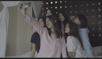
This was the first time we tried editing the digipak using pictures we already had. We didn't really like the picture as we thought it looked dirty. This was what led us to make the mockup.


We experimented with the typeface, positioning, and colors to see which matched the most.
We also discussed with our teacher and this is the feedback he gave

Our media teacher did not like how "The 1st Mini Album" and the writings underneath looked - they make it seem so full. He also mentioned how the "1st" was misread as "Ist", which we have modified through the fonts. So he suggested solely writing "KIARA" on the top to keep it simple.

Below is the final design we chose


Though our media teacher suggested to change the typeface on top, me and my group collectively agreed that it is what suits our concept the most. We also chose the color green to correlate to the next pages which is heavy on green. The pose we chose is what is best to depict freedom and "light as a feather".

Tracklist

I gave the general concept of what we want our tracklist page to look like but Timo helped a lot in designing the text.

This was when we tried making it with pictures from the beach, we found the pictures to not look as good and was too similar with the cover when we wanted more contrast.


Here we made it using pictures from the park which had more depth and looked better.

For this, our media teacher also prepared some feedback

Our media teacher suggested either removing or changing the typeface for the "Tracklist" writing as the 'L' seemed too over the top.

Below is the final design we chose


We changed the typeface of the tracklist to something simpler which highlights our artist portrait with wind-blown hair.

CD Cover


Here we tried experimenting with different pictures and we found the bubbles in the park looked the best.

Below is the final CD cover we chose


We found this looked the best and matched our concept the most

Back cover

We added typical convention of a digipak like a barcode and also an anecdote that Maxi has written.

Below is the final design we chose


Though our teacher slightly disagree with the decision to have an anecdote, we agreed that it would be good to have as audience can have an insight of who Kiara is.

Self reflection:
When we just started, I felt a bit confused so making the research helped a lot. I made the concept of the design which thankfully everyone really liked. Canva was really effective in making the designs and Sharon and Timo's feedbacks, as well as Mr Nick was really helpful when improving the design. Though experimenting was fun, I often had an art block which slowed down our progress. During the process, I also got sick which made it even harder for me to contribute and helped my teammate.


Component 3: Final Piece

This blog post, written by me (Nayana), contains the final piece of our music promotion package project. Music Video   Use this link in case...